Apdex Calculator
Score application experience from satisfied, tolerating, and frustrated request samples, then compare it against SRE latency targets.
⚙ Real SRE Presets
📊 Request Samples and Targets
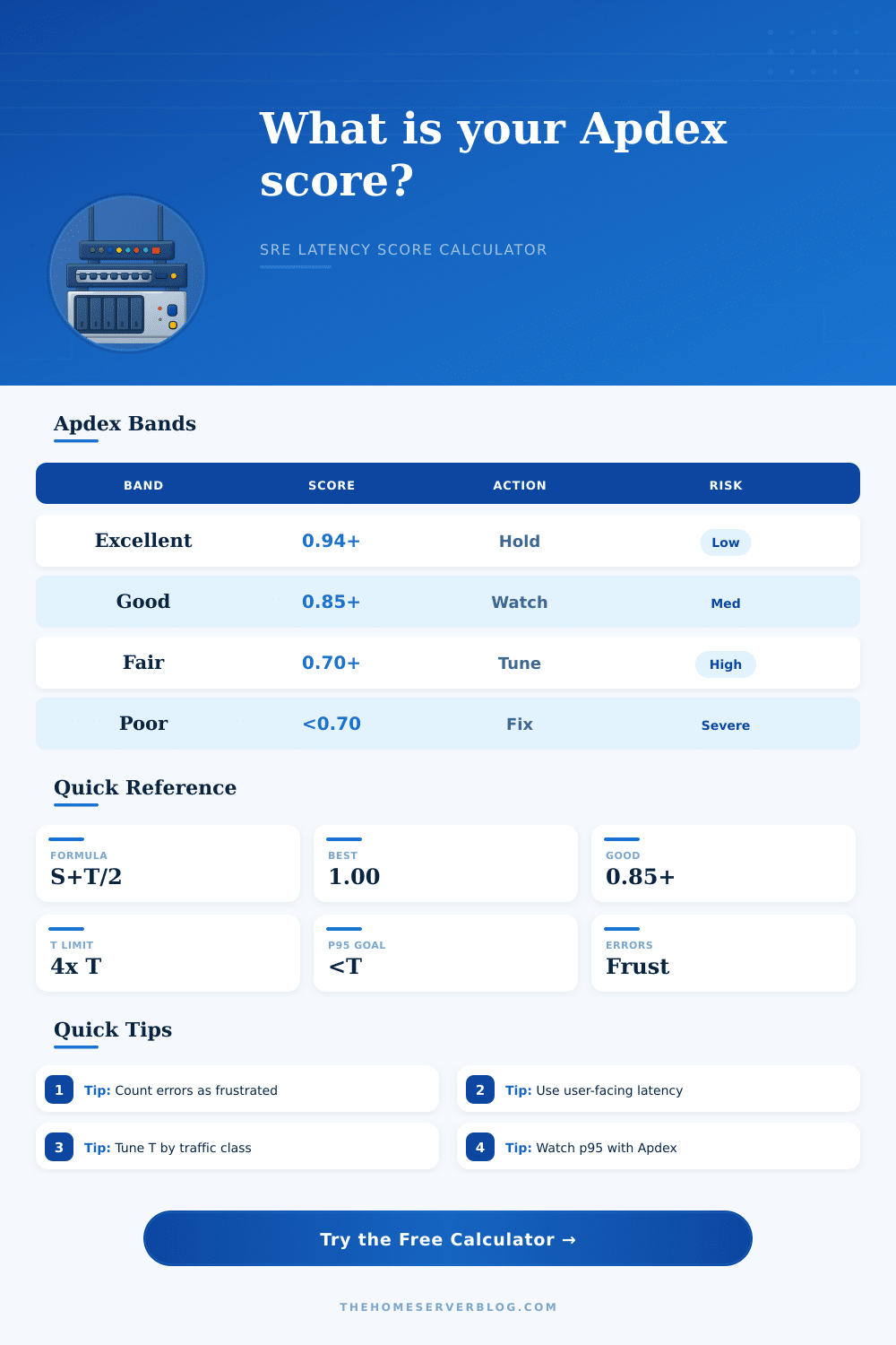
Apdex formula: satisfied requests count as 1.0, tolerating requests count as 0.5, and frustrated requests count as 0. Errors should be included in frustrated samples.
📈 Live Breakdown Tiles
🧭 Apdex Rating Reference
| Band | Apdex range | Typical meaning | Operational action |
|---|---|---|---|
| Excellent | 0.94 to 1.00 | Most users are satisfied | Protect the current latency budget |
| Good | 0.85 to 0.939 | Healthy for many services | Watch p95 and error spikes |
| Fair | 0.70 to 0.849 | Noticeable experience drag | Prioritize slow endpoint tuning |
| Poor | 0.50 to 0.699 | Many sessions feel degraded | Open a reliability improvement item |
| Critical | Below 0.50 | Experience is broadly failing | Treat as incident or urgent repair |
⏱ T Threshold and Tolerating Window
| Traffic class | Common T threshold | Tolerating window | Notes |
|---|---|---|---|
| Interactive Web UI | 200 to 500 ms | T to 4T | Use page action or route latency |
| User-Facing API | 100 to 300 ms | T to 4T | Measure at the service boundary |
| Admin Console | 500 to 1000 ms | T to 4T | Lower volume can still matter |
| Streaming Start | 1000 to 2500 ms | T to 4T | Separate startup from playback errors |
| Background Status | 1000 to 5000 ms | T to 4T | Confirm users are not blocked |
🛠 Sample Classification Rules
| Sample type | Latency range | Weight | How this calculator uses it |
|---|---|---|---|
| Satisfied | Less than or equal to T | 1.0 | Counts fully toward the Apdex score |
| Tolerating | Greater than T and less than or equal to 4T | 0.5 | Counts as partial satisfaction |
| Frustrated | Greater than 4T | 0.0 | Does not add positive score |
| Error | Failed request | 0.0 | Should be counted as frustrated |
💻 Home Server Scenario Reference
| Scenario | Target T | Target Apdex | Watch closely |
|---|---|---|---|
| Home Lab Dashboard | 300 ms | 0.90 | Database query latency |
| Plex Media Portal | 800 ms | 0.88 | Transcode startup and auth |
| NAS File Browser | 500 ms | 0.90 | Directory listing latency |
| Grafana Monitoring | 450 ms | 0.92 | Dashboard query fanout |
| Edge Cache Traffic | 120 ms | 0.95 | Cache misses and origin errors |
🔍 SRE and Latency Comparison Grid
💡 Calculation Tips
On paper, your self-hosted media server look great: Low CPU use; lots of free disk space; no critical errors in the logs. Still, when you’re browsing through your photo library, things feels slow. And occasionally, movies buffer for an embarrassingly long time when you try to stream them. Sure, you’ve got all kinds of metric at your disposal… But none of them measure what your users are actualy experiencing. That’s where an Apdex score starts to shine.
It takes raw latency number and turns them into one number that represents how happy (or not) your users will be with your service. This metric take the form of a single number that reflects user satisfaction rather then just server performance.
What Is an Apdex Score?
This is the fastest response time that your users consider instantaneous. A is the number of requests with a response time less than or equal to T. B is the number of requests with a response time greater than T but less than or equal to 4*T. C is the number of requests whose response time are greater than 4*T or that result in an error.
That’s where the twist comes in: What does T actualy mean? For example, if you are querying a local database that powers your own home lab dashboard, your users probably don’t care about more then a few hundred milliseconds (so, a T of 300ms). But if you’re providing data through an API that serves mobile device with spotty connections, you might want to get down to 200 milliseconds or less.
You can see how setting your T too low or too high results in unnecessary inflated scores and misses some actual pain points. It also flags perfectly acceptable performance as failures. To help you avoid just guessing, the page feature a reference table that lists typical ranges based off traffic class.
If an error’s a frustration, it should of been in the frustrated bucket; and that applies even if the error appears immediately. Yes, a fast five hundred is still a broken experience, and counting those failed requests will make your score reflect reality instead of just speed. In other words, satisfied = one point; toleration (requests slower than 1 second) = half a point; frustrated (any request getting an error) = zero.
That weighting prevents failures from being hidden in the tail end of performance, forcing you to see where user patience actualy runs out. Finally, it’s important to note that Apdex doesn’t replace other performance indicator such as error rates or latency (specifically p95). For instance, a large number of frustrated users compared to overall traffic could mean an application have problems even though its Apdex looks great.
Monitoring how far off your actual score is from your target provides guidance on where to focus efforts, but there’s no need for perfection; tune individual points instead of overhauling your entire system. If your Apdex is hovering at point seven somewhere in the fair band, you’re probably experiencing some noticeable drag on particular endpoint, not a systemic problem with your infrastructure.
It’s also important that those goals are reasonable, that is to say, you don’t set goals of.95 on all your tool internally. That may be over-optimizing and could cause you to miss out on things that really matter. When can I accept.85? And which efforts should my engineers prioritize? The tool provides some good examples with its presets showing how each scenario call for a different tolerance.
An API serving a batch job running in the background will behave differently than one logging into a VPN, and combining both metrics would confuse instead of clarify. It’s a change of perspective from focusing on the health of the server to trusting the users. The database is slow” stops being the discussion point and you start discussing whether the interface feel responsive.
This alters how teams use resources and decide which fixes to prioritize. Focusing your metrics where the user expects them gives you a system that appears reliable, while still being less than perfect speed-wise. Not everything has to be lightning fast. It just needs to be smooth enough that no one notices it’s there except for you.
That makes people come back again and again which is the whole point. Maybe your media server looks like it has low CPU use, but now you’ll have a good idea of why it feels sluggish, and more importantly, what you can do about it.