Base64 Image Size Calculator
Estimate image data URI weight from dimensions, format, file size, srcset variants, HTML or CSS copies, cache misses, and email client limits.
Base64 image size results
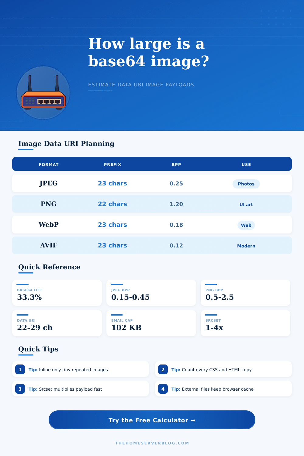
| Format | MIME prefix | Typical compressed BPP | Inline fit | Best image use |
|---|---|---|---|---|
| JPEG | data:image/jpeg;base64, | 0.15 to 0.45 | Small thumbnails only | Photos without transparency |
| PNG | data:image/png;base64, | 0.50 to 2.50 | Tiny UI art or icons | Transparency, sharp edges, screenshots |
| WebP | data:image/webp;base64, | 0.08 to 0.35 | Good for small web assets | Photos, thumbnails, mixed content |
| AVIF | data:image/avif;base64, | 0.05 to 0.25 | Efficient but compatibility-sensitive | Modern responsive imagery |
| SVG | data:image/svg+xml;base64, | Use known bytes | Good when minified and reused once | Logos, icons, simple vectors |
| Container | Added text | What to count | Image-specific risk |
|---|---|---|---|
| Base64 payload only | 0 characters | Encoded image data | Useful for API fields, not valid as HTML image src alone |
| Data URI prefix | 22 to 29 characters | MIME prefix plus payload | Each srcset candidate repeats its own prefix |
| HTML image src | About 8 extra characters | src="..." wrapper | Repeated components duplicate the whole image |
| CSS background URL | About 7 extra characters | url("...") wrapper | Every selector copy prevents shared image caching |
| Email HTML | Client-dependent | Inline image plus markup | Large HTML can clip, truncate, or be rejected |
| Image scenario | Typical dimensions | Suggested format | Inline guidance | Why it matters |
|---|---|---|---|---|
| Favicon or tiny symbol | 16 to 64 px square | SVG, PNG, WebP | Often acceptable | Low source bytes and usually a single copy |
| Email logo | 120 to 320 px wide | PNG or WebP | Check client cap | Surrounding email HTML may already be near limits |
| Blur placeholder | 20 to 80 px wide | JPEG, WebP, AVIF | Good candidate | Small payload can avoid one extra request |
| Product thumbnail | 300 to 800 px wide | JPEG, WebP, AVIF | Usually external | Repeated grid cards multiply inline bytes quickly |
| Hero or banner | 1200 to 2400 px wide | JPEG, WebP, AVIF | Keep external | Base64 lift and lost cache are usually too costly |
A small logo inlined into an email template might save a server request, but that same logo could be to large to fit into an email client’s size limit. It happens more often then you’d think.
If convenience is what you’re after, then Base64 is your friend: no need to worry about HTTP requests for little assets. With a steep tax: the encoded string are always approximately 33% bigger than its original binary file. Sounds reasonable enough until you consider that this overhead is carried on every single page view, and you never lose it to browser caching.
Why Use Base64 Images?
Once you specify the format and dimensions of your images, the page spit out the result. The calculator then do all the work of figuring out which number makes sense, saving you the trouble of guessing about conversion and coefficient values. First, you need to select between estimating an image’s size from pixels or supplying the actualy size of a file you already possess.
For instance, if you’re creating a new image from scratch, you can use pixel estimation to plan ahead. Enter the approximate pixel size of your hero banner; say a thousand two hundred pixels wide and six hundred tall. And a ballpark guess at how many bytes per pixel that’ll require given your desired compression level. (JPEGs is great for photos but choke on sharp edges; PNGs are good for text and transparency but bloat the file.)
The calculator factors these format quirks into its own calculations and presents you with real-world size estimate instead of a mere raw bytes figure. Multiplication factors are where problems generaly come into play. You may feel good about how one image compress on its own, but real-world usage of assets is rarely ever just one copy. That image could be embedded three times across your site in CSS selectors, or it could have been part of a responsive source set with versions for desktop and mobile. In that case, you’re not multiplying once, but rather piling them together within the same document structure. The multiplier ask for both your average scale factor as well as the number of variants, so we can simulate the accumulation effect. It also takes into account potential reuse of that HTML across emails or templates.
Choosing to inline instead of serving externally cause missed cache hits. These add up fast at scale when you consider thousands of view. Also keep in mind the email client cap. Most clients has a maximum HTML document size. Many clients strip content if the total HTML document exceeds a specific size, often around one hundred kilobytes.
The tool lets you enter your current HTML overhead and a safety buffer. This helps you determine if your new base64 image will push you over limit. It doesn’t only calculate the raw data but the final inline size with all of its surrounding syntax such as attribute wrappers and prefixes. Why? Because they adds bytes to the final byte count. Sometimes you may think an image will fit, only to find out there isn’t any slack left after taking into account the surrounding syntax.
This is a trade-off between performance vs, Inline things that need to load right away include tiny things like favicons, small icons, and critical parts of your user interface. You don’t want to pay the cost of network latency for these. You’re willing to pay the size penalty to get them rendered instanty.
On the other hand, large photographs should of been loaded from an external file so that browsers may heavily cache them. To help you make this decision, the tool includes a reference table that categorizes common use cases. Based off how well it fits and format efficiency, it will tell you what works best in what scenario. Don’t take rules of thumb as gospel; you must test your own configuration. Different email clients parse differently, images has their own compression profiles, etc.
The best way to get an accurrate picture is to optimize your assets, then use the known file size mode, it removes all estimation error. You don’t want to banish base64 all together. You just want to use it purposefully when you know precisely what impact each byte has on your final document.
Once you have that insight, you no longer guess and instead begin to calculate. A potential layout breaking problem becomes a carefully designed decision. Where performance matter most, you retain the speed of loading; where bloat slows you down, you get rid of it.
Ultimately, attention to detail, the things few others notice (yields the littlest improvements).