HomeServerBlog web performance tool
Critical Rendering Path Calculator
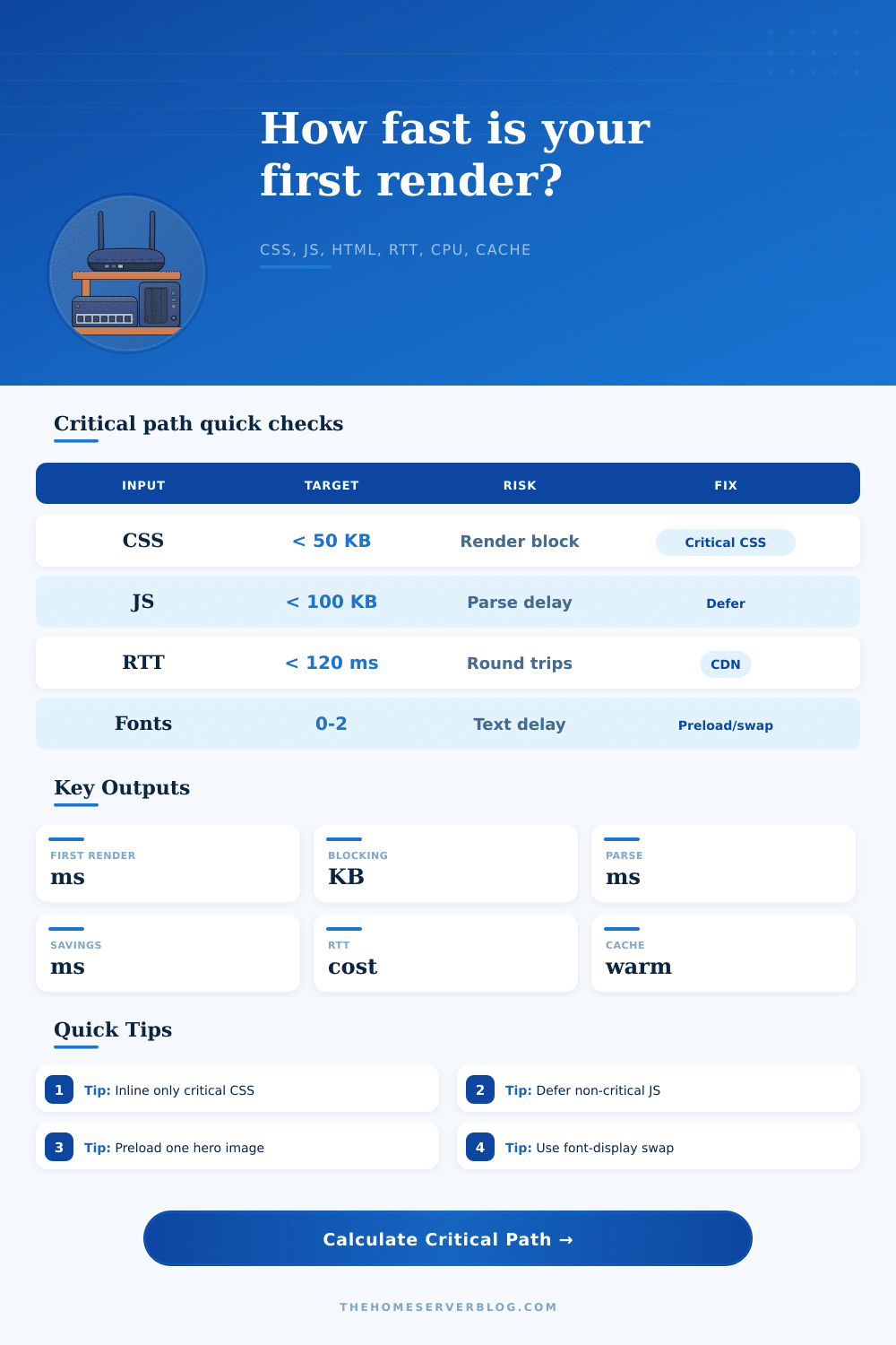
Estimate the path from first byte to first render by combining HTML discovery, render-blocking CSS, blocking JavaScript, font requests, hero image preload pressure, bandwidth, RTT, CPU parse speed, and warm-cache percentage.
Critical path breakdown
Optimization model
Usually needs low RTT, small CSS, minimal blocking JS, and useful cache reuse.
Inline or split only above-the-fold CSS, then load the full stylesheet after render.
Head scripts and synchronous bundles have the highest first-render penalty.
HTML plus critical resource discovery should avoid deep request chains.
| Page type | Typical blocking bytes | First render posture | Best first fix |
|---|---|---|---|
| Static docs page | 20-80 KB | Usually network-light and cache-friendly | Keep CSS compact and avoid third-party head scripts |
| WordPress landing page | 140-280 KB | Plugin CSS and jQuery-era scripts often block | Remove unused CSS and defer analytics/widgets |
| React SPA cold load | 250-700 KB | JS parse and hydration dominate after transfer | Route split, server render, and defer non-critical chunks |
| WooCommerce product page | 220-520 KB | CSS, gallery JS, cart scripts, and image preload compete | Unload cart fragments and lazy-load gallery extras |
| Network condition | RTT | Bandwidth | Critical path behavior |
|---|---|---|---|
| Same-region CDN | 15-45 ms | 50-200 Mbps | CPU and request ordering matter more than transfer time |
| Home broadband | 35-90 ms | 25-250 Mbps | Most ordinary pages render well if JS is deferred |
| Mobile 4G | 80-180 ms | 5-25 Mbps | Round trips and font discovery can become visible |
| Congested or rural link | 160-350 ms | 0.8-6 Mbps | Every blocking byte and extra request chain is expensive |
| Resource | Blocks render? | Calculator treatment | Optimization lever |
|---|---|---|---|
| HTML document | Yes, discovery gate | Full transfer plus parse cost | Stream, compress, simplify, and flush early hints |
| CSS stylesheet | Yes by default | High priority transfer and CSSOM parse | Critical CSS, media attributes, remove unused rules |
| Blocking JavaScript | Yes when sync | Transfer, parse, compile, and execution tax | defer, async, modules, code splitting |
| Fonts and preload image | Indirect | Connection and bandwidth pressure before paint | font-display, subset fonts, preload only LCP image |
| Metric band | First render | Blocking bytes | Practical reading |
|---|---|---|---|
| Fast | Under 1000 ms | Under 120 KB | Likely acceptable on broadband and modern mobile |
| Watch | 1000-1800 ms | 120-300 KB | One or two obvious blockers probably dominate |
| Slow | 1800-3000 ms | 300-600 KB | Expect visible blank screen or late styled content |
| Critical | Over 3000 ms | Over 600 KB | Needs architectural fixes, not only minification |
Until your browser can paint pixels on the screen, it doesn’t give a damn about your design vision. All it care about is painting something on the screen. This process is the critical rendering path, which are the series of steps necessary to render raw HTML into visual form. For most developers this is a theoretical notion mentioned in performance guidelines. It overlooks the fact that each millisecond of round-trip time and each byte of blocking CSS add up before user sees anything useful.
Once you plug in your actual network conditions and resource sizes, the calculator above do the math for you. You won’t have to guess how many milliseconds of parse delay are actualy costing you.
Understanding the Critical Rendering Path
When the browser receive the HTML document from the server, this is when the journey starts. It may sound simple, but that first file, how big it is matter far more different than you’d think. Take for example, if your HTML is full of unnecessary markup and inline styles, the browser will has to read and transfer that. Then it must figure out what else it need.
And here is where a lot of sites comes to a halt. The browser spots a stylesheet link, stops rendering and awaits those styles to be downloaded. This is what we call render-blocking behavior. Why? Because you’re making the user wait for visual rules that may not even apply to what they can see (yet), such as footer.
The situation is even worse with JavaScript. Not only does it have direct access to the DOM, but it can also forces the browser to block while fetching and executing a synchronous script. During all that time, the browser stop parsing HTML and waits for your JavaScript to finish before it continues. Resources is loaded serially rather then in parallel. It’s like a waterfall.
And this page has a nice reference table explaining exactly what happens when looking at different page types: Is it a dynamic application or just static documentation? A React single-page application might have three times more blocking JavaScript than a simple blog post, which means its critical path is naturaly longer and more fragile. If so, its critical path will naturally be longer and more prone to breaking.
Every inefficiency you bake into your code gets multiplied by network conditions. Parsing is slow. Heavy payloads? On a fast broadband connection it won’t matter; they’ll get transferred nearly instantly. But on a congested network or mobile data those files will turn into road blocks. The enemy of speed here is round-trip time. Your payload has to travel back and forth from your server to the user’s machine, which means each extra hop between them add latency that you can’t optimize away with minification. Chained dependencies mean multiple hops: each dependency will require a round trip of its own. And when those latencies adds up, what used to take half a second becomes a few seconds of a blank screen.
There is one more wrinkle: fonts. In browsers, text won’t be painted until web fonts have loaded so we don’t see a flash of unstyled text. That’s a reasonable default behavior, except if you’re loading a lot of different fonts, each of which could potentially be large in size. Not only does it take longer to download, there is also a render blocking delay. Font display swap tells the browser to paint with your fallback font first and then update the styling once the custom font have loaded. This tiny config tweak makes a big difference in how fast the site feels. Users see something immediately instead of a blank page while they wait for your design to appear.
You should of known that. Optimizing isn’t about going for gold or hitting perfect numbers; it’s about trimming away the largest impediments. Hundreds of milliseconds can be saved on the critical path by splitting up your CSS so it only renders above-the-fold styles. Non-critical JavaScript can also be deferred so that the browser doesn’t waste time running code that won’t impact first view. Preloading important resources such as a hero image directs the browser to focus on what is most important. The improvement move the responsibility from network delay to smarter ordering of resourses.
Smaller isn’t always better: we’re not trying to shrink all files for the hell of it. We’re trying to remove any unnecessary blocks from that first path so that paint #1 happens as quickly as possible. Understanding what’s needed vs what can wait gives you control over how your page loads. More than small tweaks, this architecture is often what makes the difference between a fast site and a slow one.
Don’t let the user stare at a white void/ loading spinner, they want to see some value sooner rather then later. Learning this path requires understanding how to deliver content quickly, yet still respecting the browsers limits. Real performance comes from that balance.