Image Optimization Savings Calculator
Estimate monthly transfer reduction, stored image footprint, and page weight savings for a blog, self-hosted gallery, or home server web app.
⚡Web and Image Optimization Presets
🔧Calculator Inputs
Optimization Savings Summary
💻Equipment and Spec Comparison Grid
📊Reference Tables
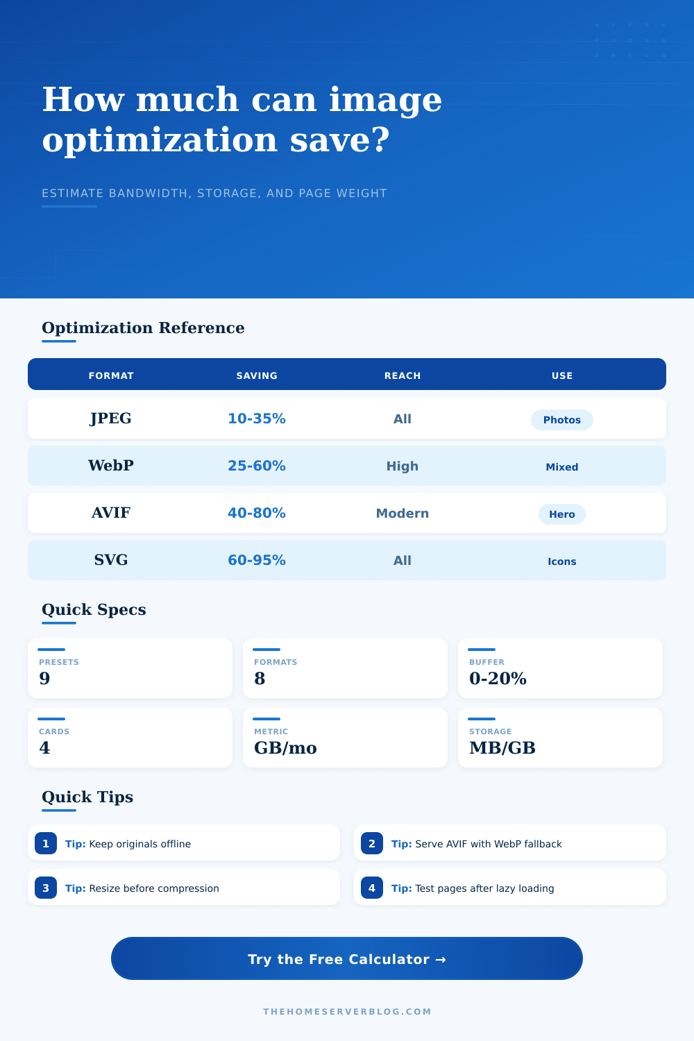
| Optimization Workflow | Typical Savings | Stored Copies | Best Fit |
|---|---|---|---|
| MozJPEG quality 75 | 10% to 35% | 1 optimized JPEG | Legacy-friendly photo blogs and mixed clients |
| WebP balanced | 25% to 60% | WebP plus fallback JPEG | WordPress, static blogs, recipe posts, dashboards |
| AVIF balanced | 40% to 80% | AVIF plus WebP/JPEG fallback | Hero images, large galleries, high traffic pages |
| Responsive WebP set | 35% to 70% | Multiple width variants | Mobile-heavy sites and image-rich article pages |
| Project Size | Page Views | Images/Page | Planning Note |
|---|---|---|---|
| Small homelab blog | 5,000 to 15,000 per month | 3 to 6 | WebP conversion is usually enough |
| Self-hosted gallery | 10,000 to 40,000 per month | 12 to 30 | Responsive thumbnails matter more than format alone |
| Documentation portal | 20,000 to 80,000 per month | 4 to 10 | Compress screenshots and diagrams separately |
| Popular media site | 80,000+ per month | 8 to 18 | Use staged encoding and cache validation |
| Responsive Width | Common Use | Typical File Target | Server Note |
|---|---|---|---|
| 320 to 480 px | Mobile cards and thumbnails | 20 to 90 KB | Keep EXIF stripped for faster cache fill |
| 768 to 1024 px | Tablet content images | 80 to 180 KB | Good default for article inline images |
| 1280 to 1600 px | Desktop article images | 150 to 320 KB | Use only when layout really needs it |
| 1920 px and up | Hero or lightbox images | 240 to 650 KB | Reserve for high value visual detail |
| Server Stack | Optimization Tool | Runtime Pattern | Practical Limit |
|---|---|---|---|
| WordPress on Nginx | ShortPixel, Imagick, or cwebp | Queue after upload | Watch PHP memory on large batches |
| Static site generator | Sharp, Squoosh, or Eleventy Image | Build-time variants | Build cache is important for large libraries |
| Containerized media app | libvips or Sharp worker | Background job queue | Throttle CPU on low-power mini PCs |
| Reverse proxy CDN | Cache headers plus format negotiation | Edge or proxy cached | Validate fallback behavior for older clients |
Calculations use binary storage units: 1 MB = 1024 KB and 1 GB = 1024 MB. Results are estimates for capacity planning and before/after comparisons.
💡Practical Tip Boxes
Maybe you began with the best of intentions. Maybe you didn’t even think about size of an image when you found one that you liked and used it, either by downloading a stock photo or grabbing a high-resulution file from a camera. It’s nice and sharp on your computer monitor, and it loads fine over your connection.
But the web isn’t your living room. Every time you post an image to a server without optimizing it, you create a cost for every visitor to your website. It show up in the form of bandwidth costs, longer page load times, and irritated customer who click away while they wait for picture to load.
Why Image Optimization Matters
After you input your traffic patterns (which the tool does for you), you don’t need to guess at these coefficients, the tool will do calculation for you. Instead, it translates abstract “the site is slower” into concrete “megabytes saved per month.” But here’s the catch: in order to get meaningful figures, you need to know what you’re measuring.
Lots of folks obsess about file formats, and they’ll pick AVIF because it sounds cool or JPEG because it seems safe. But while the format is half of the equation, the other half are its size. A four-megapixel image served to a phone screen displaying one million pixels waste data, no matter how well the data is compressed.
By asking for the size of your original files and your average images-per-page, the calculator also forces you to face the volume of content you’re dealing with. You might be running a blog that see 25k monthly views and six image per post. You’re pushing around a lot of data.
From there, the choice of optimization workflow will determine how much of that you can cut down. For most sites, WebP is a good happy medium: It provide substantial compression above JPEG without ruling out legacy browsers. AVIF offers even more compression. However, it require more CPU cycles to encode and has less browser support. It’s a real trade-off, one in which you burn more server resources to produce the files, but save on bandwidth front.
The other issue is with storage: When optimizing images, you typically don’t delete the originals. Instead, you produce variant. You might also keep raw file for archiving, the WebP variant for delivery, and the responsive set for mobile. While optimization reduces your delivery footprint, it increases your storage footprint. That’s something people often misunderstand. Optimization isn’t a subtraction problem; it’s a multiplication problem (you trade speed for space), so make sure you check the storage metric in the results to see if your disk space will accommodates the increased number of files.
When we’re talking about responsive sizing, that shifts the calculation: You serve a smaller variant to smaller screens, while still maintaining a high level of perceived quality. That’s the savings we factor into the calculator, along with the compounded savings of both size reduction and format conversion. Eighteen percent from responsive sizing times thirty percent (format conversion) compounds fast.
That’s a big difference in bandwidth, enough to mean the difference between sticking to your hosting plan or being overcharged for excess. It’s a tricky choice. To help with that, the page features a table of reference figures showing the best fit and potential savings. Use those to determine whether you really need a complete pipeline or if aggressive optimization is overkill for your set up.
If you have a media-rich gallery, then don’t skip it: it’s a mistake, whereas if you only host a small personal blog, it may not make enough difference to justify all that extra work on the server. It’s a trade-off between bandwidth savings on delivery versus the cost in CPU time spent encoding will depend on your infrastructure and the audience. Every kilobyte matter for a highly trafficked hub, while marginal gains may not be worth the extra work on a low-traffic site.
Try your fallback paths. Keep those originals offline. Enjoy savings after you confirm that the lighter file makes its way into the browser.
Optimizing isn’t set-it-and-forget. It’s a habit: check the metrics, adjust the strategy. You’ll see in the numbers whether you’re making any difference, whether you’ve won the bandwidth war or merely added some noise.
Run the estimate based off the inputs you know, then examine the gap between where you stand and where you want to be. That’s where the performance lies.